
Google Ads reporting
Google Ads performance, clear at a glance
Search, Performance Max, Shopping, Video and Demand Gen — down to keywords, search terms, conversions and ROAS, scoped to one client. Create a workspace to open the report, or preview what’s inside.
Already have a workspace? Sign in
- Plans from $99/month
- Built for multi-client agencies
- Your brand across the console

Google Ads reporting
The Google Ads reporting dashboard for agencies and advertisers
Turn raw Google Ads data into a report a client actually understands. Every campaign type, keyword, audience and conversion has a clear place in the dashboard, so teams can move from an account summary into detailed breakdowns and prepare a client-friendly review without rebuilding the layout each month.
Connected reporting
From Google account to client report
Four short steps take a client from a linked advertiser account to a report you can present.
Connect Google Ads
Authorize the Google account that can see your advertiser accounts. You do it once for the workspace, and the same connection serves every client.Agency plan and upLink an account to the client
Choose the client in the header switcher, then pick one advertiser account for it. Each account belongs to one client, so figures never cross over.Choose the dates to sync
Pick the range you need and select “Sync these dates”. Want an earlier month later? Fetch just those dates and the report fills in.Read the report
Eleven tabs open on campaigns, bid strategies, keywords, search terms, audiences and more, with a date range and a period comparison in the toolbar.
What fills the report
Cost, conversions and ROAS from the account itself
- Campaigns, ad groups, ads and assets, each with cost, clicks and conversions
- Keywords, and the search terms that triggered your ads
- Audience, demographic, device and ad schedule breakdowns
Put every client’s Google Ads on one page
Create a workspace and connect Google Ads. Then link your first client’s advertiser account and sync the dates you need.
Connected Google Ads reporting is included from the Agency plan.
On this page

Google Ads reporting for every campaign type
Search, Performance Max, Shopping, Video and Demand Gen in one report
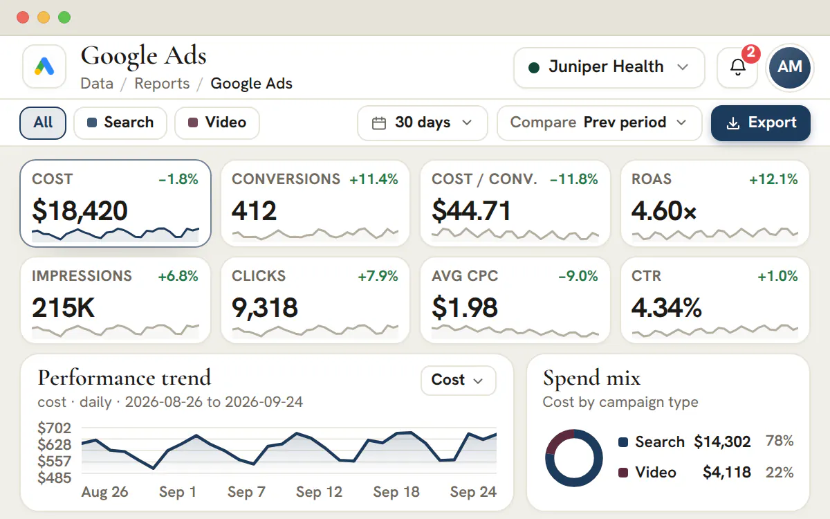
Filter the whole account by campaign type and watch every metric re-base instantly — Search, Performance Max, Shopping, Video and Demand Gen each reported the way that channel actually behaves. Performance Max is no longer a black box: spend, conversions and value sit beside your Search and Shopping numbers so you can compare like for like.
A spend-by-type breakdown shows at a glance where the budget concentrates and which campaign types are pulling their weight this month, so reallocation decisions are obvious instead of guesswork.
Keyword and search-term reporting
See the queries that convert — and the ones wasting spend
Report on keyword performance and the actual search terms that triggered your ads, with cost, clicks, conversions and conversion rate for each. The terms quietly draining budget surface immediately, turning your negative-keyword list into a data-driven decision rather than a monthly hunch.
Because match type, impression share and CTR sit alongside conversions, you can tell the difference between a keyword that needs a bid change and one that needs to be cut — and show the client the reasoning behind every optimization.
Conversion, CPA and ROAS reporting
Tie every dollar of spend to revenue
Cost per acquisition, conversion value and return on ad spend are first-class metrics, not an afterthought. Track ROAS and CPA against target at the account, campaign and ad-group level so the conversation moves from “how many clicks” to “how much revenue,” which is the only number most clients care about.
Trend each conversion metric over any date range with period-over-period comparison, so a good month is provable and a soft one is explained before the client has to ask.
Campaign, ad group, ad and asset drill-down
From an account overview to a single sitelink
Start at the account and drill straight down — campaign to ad group to individual ad — without losing the metrics or the date range you were looking at. The reporting follows the same hierarchy you build campaigns in, so finding the underperforming ad group takes seconds, not a fresh export.
Assets and extensions are reported too: sitelinks, callouts and other assets get their own performance view, so you can prune the ones that never earn a click and double down on the creative that does.
Audience, demographic, device and ad-schedule reporting
Know who converts, on what device, at what hour
Break performance down by audience and demographic to see which segments actually convert, then layer in device and ad-schedule reporting to find the hours and platforms worth more of the budget. Dayparting and device bid decisions stop being intuition and start being evidence.
Each breakdown shares the same metrics and filters as the rest of the report, so a demographic insight relates cleanly to the campaigns and keywords driving it.
A client-ready Google Ads report layout
Your branding and a consistent review structure
Keep account summaries, campaign tables and breakdowns in one report structure scoped to a single client and presented with your agency branding. The workspace provides a consistent place to review the report, while data-source setup remains a separate step.
That repeatable organization helps account teams spend less time rebuilding presentation layouts and more time reviewing creative, audiences and efficiency with the client.
What a client-ready Google Ads dashboard puts on one screen
Headline tiles for the numbers a client asks about first, a trend line, a spend mix by campaign type, and tabs for everything that explains them.
The headline tiles are cost, conversions, cost per conversion and ROAS, then impressions, clicks, CPC and CTR. Select any tile and it becomes the trend line. A channel filter narrows every tile and tab to one campaign type, and the toolbar sets the date range and, when the fetched dates allow it, a comparison with the previous period or the previous year.
| Tab | The question it answers | Where Google sets a limit |
|---|---|---|
| Campaigns, ad groups and ads | Where did the budget go, and which layer is pulling results down? | Performance Max has asset groups and assets instead of ad groups and ads |
| Keywords | Which bought terms earn their cost? | Keyword performance exists for Search campaigns only |
| Search terms | What did people type before they clicked? | Google withholds some rare terms, so the list is a sample |
| Audiences and demographics | Who responds? | Age, gender and household income are separate totals and cannot be crossed |
| Devices and ad schedule | Where and when does it convert? | Connected TV, other and unknown devices stay separate when Google reports them |
| Assets and extensions | Which sitelinks, callouts and images carry the account? | A performance label reads Not rated when Google does not provide one |
The same layout exists for every client, so a review in March reads like a review in April. The whole catalogue sits in the reporting hub.
Google Ads metrics, defined the way a client needs them
Every ratio below is worked out from summed totals, so a quiet day cannot drag an average.
- Cost
- What the account spent over the dates shown, in the account's own currency.
- Impressions
- How many times an ad was shown. On its own it says nothing about whether anyone noticed.
- Clicks
- How many times people clicked an ad.
- CTR
- Clicks divided by impressions. Read it per campaign type, because Search and Video are not meant to match.
- Avg CPC
- Cost divided by clicks: what one click cost on average across the campaigns in view.
- Conversions
- Actions Google credits to your ads. The total can carry decimals because Google can credit part of a conversion to an ad.
- Conversion value
- The value Google attaches to those conversions, in the account currency. It stays at zero when the account records no value.
- Cost / conv.
- Cost divided by conversions: the price of one result across the campaigns in view.
- ROAS
- Conversion value divided by cost, shown as a multiple. The higher the multiple, the more value each unit of spend returned.
Tip
Fetch recent days again before a review
Google can credit a conversion days after the click, so the newest days tend to rise. Compare complete periods, and run the fetch again over the last stretch of dates before you open the report with a client.
Connecting Google Ads to a client, and what to expect
The authorization belongs to the workspace, the mapping belongs to the client, and a fetch brings in only the dates somebody chooses.
Authorize Google once
An administrator signs in on Google's own consent screen with a login that can see your advertiser accounts, including accounts under a manager account. The same authorization serves every client.
Add other logins when clients use their own
Clients often advertise under unrelated Google logins. Connect another Google account and the picker groups advertiser accounts under the login that found them, so none goes missing.
Link one advertiser account to the client
Choose the client in the header switcher, pick the advertiser account and link it. An account can report for one client only, and a client has one account at a time. Change advertiser swaps it.
Choose the dates and sync
Pick a range and select Sync these dates. One request covers up to 90 days and can start as far back as 456 days, so a longer history takes a few requests.
Read the report
The newest day you can fetch is yesterday in the account's own time zone, because Google publishes complete days. From the Agency plan up, until an account is linked and dates are fetched, the report shows setup steps instead of figures, and it never fills the gap with illustrative rows.
Plan
Which plan connects Google Ads
Linking a Google Ads account takes the Agency plan ($299 a month) or higher. Studio ($99 a month) opens the same layout with labelled illustrative rows, which is enough to learn it.
Microsoft Advertising and LinkedIn Ads link in the same way, one account per client.
Who can do what
- Administrators connect Google, link accounts and fetch dates. Those permissions cannot be delegated.
- Team members read the reports of the clients they are assigned to, once an administrator has granted report access.
- A separate export permission controls CSV downloads.
Performance Max, search terms and the limits Google sets
A trustworthy report says where its data stops. These are the edges of Google's own data.
Performance Max reports assets, not ad groups
A Performance Max campaign is built from asset groups and assets, so its rows sit under those names rather than under ad groups and ads. Its audience signals come without per-signal results, and the report does not invent any.
Search terms are a sample, not a census
Google withholds some search terms to protect privacy, and Performance Max search-term insights are a separate dataset from standard Search terms. Use the list to find waste and new ideas, and use campaign totals when you need spend.
Tabs do not have to add up to the account total
The headline tiles and the spend mix use the same campaigns, so they agree. Search terms, audiences and demographics can include real delivery from items that are no longer current, so their rows need not sum to the campaign totals.
Missing days stay missing
When the dates you chose are only partly fetched, the report says partial or unavailable instead of drawing zeros. A comparison against days that were never fetched is switched off rather than shown as a decline, and the toolbar says why.
A repeatable monthly Google Ads review for clients
Six passes through the report, from the account total down to the changes you will make next month.
Read the tiles for the range
Note cost, conversions, cost per conversion and ROAS. Switch the comparison on only when both periods were fetched.
Split by campaign type
Use the channel filter so Performance Max, Search, Shopping, Video and Demand Gen are not blended under one cost-per-conversion target.
Find the layer that moved
Open campaigns, then ad groups and ads, and stay on the layer where the change begins instead of explaining it with the one above.
Decide on terms
Read keywords beside search terms. Add wasted terms to the negative list, and note the converting ones that deserve a keyword of their own.
Check who, where and when
Audiences, devices and the ad schedule show where to shift bids or hours. Treat a small segment as a hypothesis, not a result.
Write the changes and owners
List the three changes you will make, who makes them and when you will look again, and attach the list to the client's project.
The next month's campaigns are drafted in paid media planning on the Agency plan and up, and the terms you decide to add can be kept in keyword lists.
Google Ads reports versus spreadsheets, exports and BI tools
Each way of reporting has a job. Pick by what the client needs to see and who will maintain it.
| Option | Best for | Trade-off |
|---|---|---|
| This dashboard | A per-client review in your branding, built from the linked account's campaigns, keywords and search terms | It reads Google Ads only, its layout is fixed, and a person chooses which dates to fetch |
| A CSV download from a tab | Moving a tab's rows into a spreadsheet or BI model | It needs the export permission, and each file holds one tab and one date range |
| Google's own reports and scheduled emails | Ad hoc questions, and anything the interface offers first | One account at a time, with Google's definitions and layout |
| A spreadsheet or BI model built on exports | Blending Google Ads with CRM revenue or other platforms | Someone must build and maintain it for every client |
If by report generator you mean a button that produces a PDF, this dashboard does not do that. The report is the screen you read, plus CSV downloads. For organic search beside paid, see Search Console reporting.
Frequently asked questions
How do you report on Performance Max campaigns for a client?
Filter the account by campaign type and Performance Max is reported beside Search, Shopping, Video and Demand Gen with its own spend, conversions and conversion value, instead of disappearing into an account total. The spend-by-type breakdown then shows how much of the budget that campaign type is taking, which is usually the first thing a client asks about it.
What is the difference between keywords and search terms in a Google Ads report?
A keyword is what you bid on; a search term is what somebody actually typed to trigger the ad. The report gives each its own tab, with cost, clicks, conversions and conversion rate on both. Reading them together is how wasted spend surfaces — the loosely matched terms that spend, never convert and belong on the negative list.
How is ROAS calculated in a Google Ads report?
Return on ad spend is conversion value divided by cost. It sits in the headline tiles beside cost, conversions, cost per conversion, impressions, clicks, average CPC and click-through rate, and the same metric is available at account, campaign and ad-group level — so a strong account number can be traced to the campaigns actually producing it.
Can a Google Ads report show which ads, assets and extensions are working?
Yes. The report follows the account hierarchy from campaign to ad group to individual ad, and keeps a separate tab for assets and extensions so sitelinks and callouts get their own performance rows. Drilling in keeps the date range and metric you were already looking at, so finding the weak ad group takes seconds rather than a fresh export.
What does search impression share tell you in a Google Ads report?
Impression share is the proportion of the auctions you were eligible for where the ad actually appeared, and it sits under the impressions tile. It is the honest answer to “can this account absorb more budget?” — when the share is already high, growth has to come from new keywords or campaign types rather than from bidding harder on the ones you own.
How do you compare this month's Google Ads results with the previous period?
The toolbar carries a date range — 7, 14, 30 or 90 days, or the current month — plus a comparison control set to the previous period or the previous year. With comparison on, every headline metric carries its change against that baseline, so the report answers “compared with what?” in the same view instead of in a second export.
Which plan includes connected Google Ads reporting?
Connected Google Ads reporting in AI Marketing Dashboard starts on Agency. Studio can open the layout but cannot link a client's advertiser account. Agency costs $299 a month for 15 client accounts, Scale costs $699 for 50, and Enterprise is quoted. Pick the plan by roster size, since the report itself works the same on all three.
Can one workspace connect several Google accounts and manager accounts?
Yes. A workspace can hold several Google authorizations at once, which suits clients that advertise under their own logins. The picker lists the advertiser accounts beneath any manager account and groups them by the login that found them. Each advertiser account can still report for only one client.
How far back can I fetch Google Ads data?
A single request covers up to 90 days and may start as far back as 456 days. For a longer span, fetch it in sections. The newest day available is yesterday in the ad account's time zone, because Google publishes complete days only.
Can I download Google Ads report data as a file?
In AI Marketing Dashboard, members who hold the export permission can download any tab as a CSV for the dates they are viewing, which suits spreadsheets and BI models. There is no PDF or slide generator, and the Export button on the illustrative layout a Studio workspace sees only displays a confirmation.
Why are some search terms missing from the report?
Google withholds some search terms to protect privacy, so the Search terms tab is a sample of what triggered your ads rather than a full list. Performance Max search-term insights are a separate dataset from standard Search terms. Use campaign totals for spend and the terms list for finding waste and ideas.
Can two clients share one Google Ads account?
No. An advertiser account reports for one client, and a client reads one advertiser account at a time. Mapping an account that already belongs to another client is refused, which keeps one client's figures out of another's report. Use Change advertiser when a client moves to a different account.
What happens if the Google authorization stops working?
The report shows a Reauthorization required banner, with a Reauthorize button for administrators. Figures already fetched stay on screen, but no new dates can be fetched until an administrator reconnects, and if Google has revoked access outright the stored rows are hidden. Reconnecting repairs the existing connection in place, so clients already linked keep their accounts. Illustrative rows are never substituted while data is unavailable.